
Wayfair Brand Evolution
More than a refresh – this was a recalibration. With brand recognition lagging behind key competitors, Wayfair set out to refine its visual identity for a world where clarity, consistency, and adaptability are essential. The result: a modernized mark that honors the brand’s equity while forging a path forward.
Objective:
Reimagine Wayfair’s core brand elements to improve recognition and recall across physical and digital touchpoints. The goal was to resolve key challenges with the existing identity – limited scalability, legibility issues, and dated design elements – while preserving familiar equities like the lowercase wordmark, pinwheel icon, and iconic purple hue. The updated identity introduced a simplified, monochromatic pinwheel and a modernized, more legible typeface to create a system that’s flexible, cohesive, and built for the future.
Responsibilities:
Brand Identity Evolution, Logo Refinement, Typography Updates, Color System Development, Digital & Print Guidelines, Stakeholder Presentation, Cross-Functional Creative Alignment


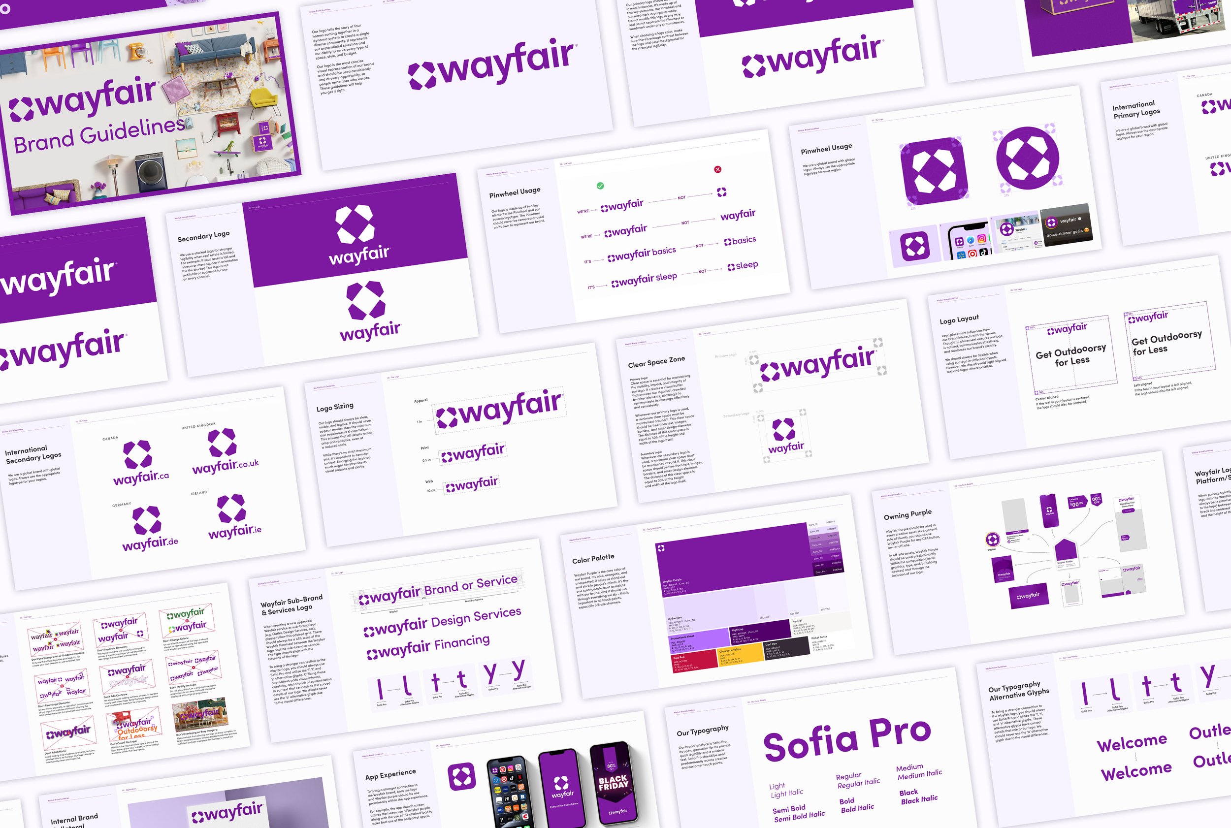


Wayfair Purple epitomizes the heart of the brand, evoking feelings of warmth, comfort, and belonging—just like home. Bold, energetic, and unexpected, it leaves a memorable mark, infusing spaces with personality and style. As the hue most closely associated with the brand, it should seamlessly infuse every facet of work, creating a cohesive and inviting experience.


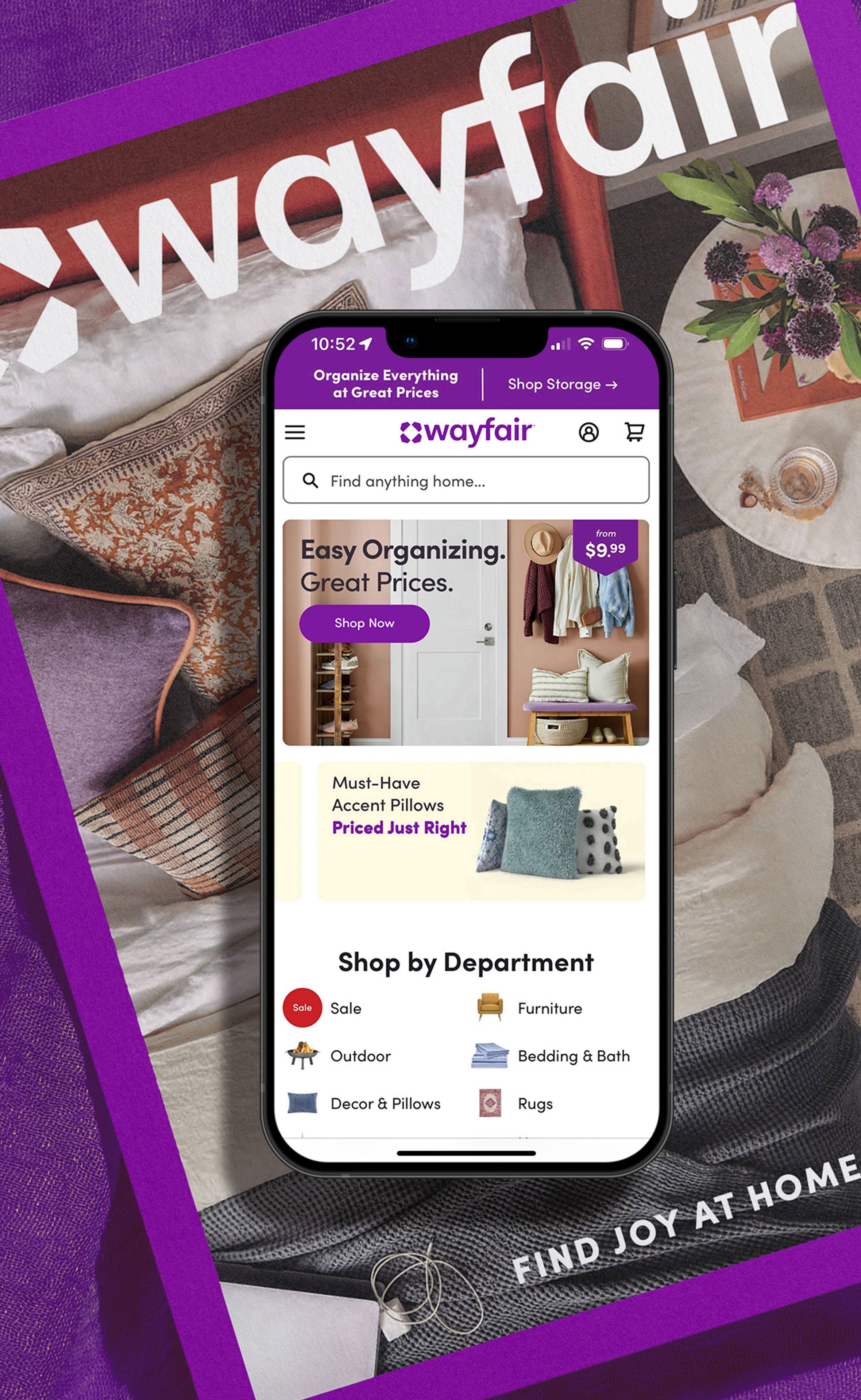
Digital Guidelines
Commercial

